UI / UX Design
StayNord Booking App
A personal UX/UI project designing a seamless and transparent booking experience for mountain retreats — from cozy cabins to luxury villas — inspired by Nordic simplicity.
Year :
2026
Industry :
Travel
Client :
Personal project
Project Duration :
4 weeks

Problem :
Travelers looking for mountain accommodation are often overwhelmed by cluttered interfaces, complicated filter systems and a lack of transparency during the booking process. Finding the right place — whether a luxury villa or a cozy camping spot — requires navigating through excessive information with no clear hierarchy, making it difficult to compare options and book with confidence.


Research :
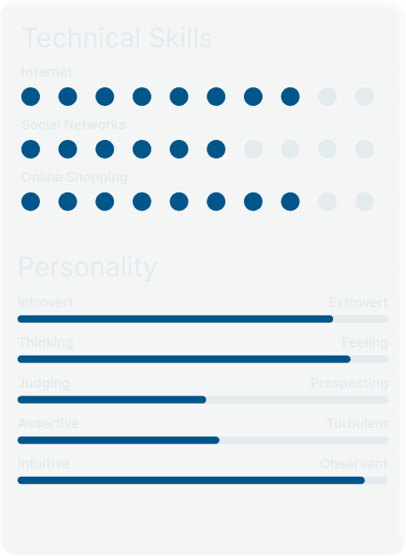
Understanding Marko meant understanding a specific kind of frustration — the feeling of knowing exactly what you want but struggling to find it through layers of irrelevant information.


Through a detailed competitive analysis of Airbnb, Booking and Agoda, customer journey mapping and feature prioritisation, I identified the key moments where the booking experience breaks down and where StayNord could do better.

Design process :
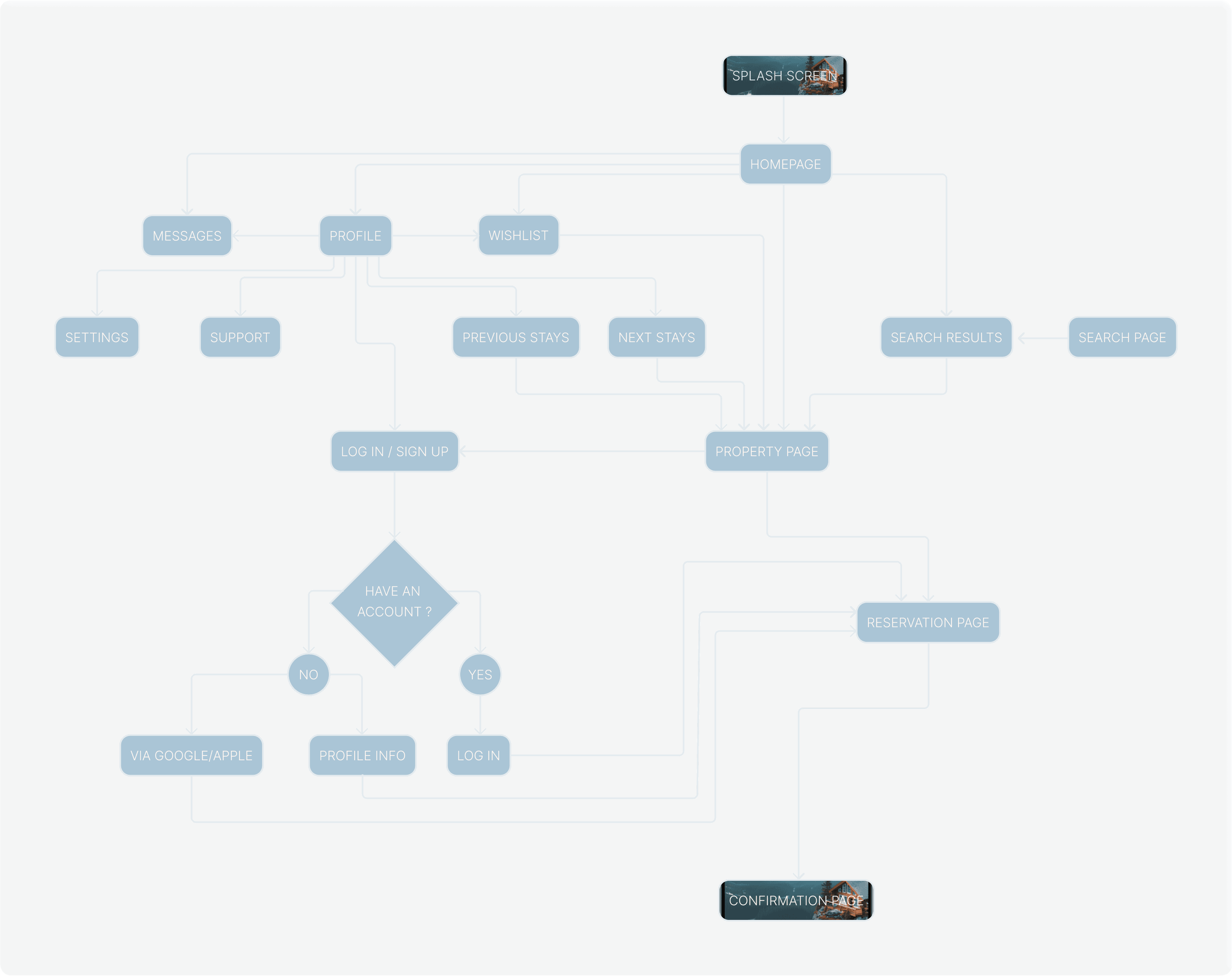
Starting with user flows, I outlined the essential booking journeys to ensure clarity and efficiency from the very first interaction. Once the flow felt intuitive, I moved into low-fidelity wireframes, focusing on structure and layout before any visual decisions were made.
Building on that foundation, I developed a design system that defined core components — from rounded icons and button styles to variations of the search bar, which became a central element of StayNord's identity and user experience.



Solution :
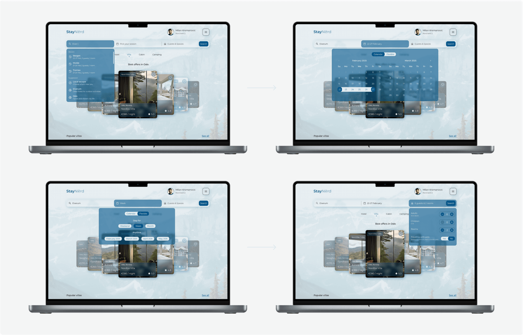
StayNord addresses the core frustration of modern booking platforms — information overload. A Nordic-inspired glass interface strips away the unnecessary, bringing search and discovery to the forefront through an intuitive navigation and search bar that surfaces the right options instantly.


Filters are smart and minimal, showing only what matters. The checkout flow is structured in clear, logical steps — ensuring full transparency on pricing, amenities and availability without overwhelming the user at any point in the journey.


Booking experience :
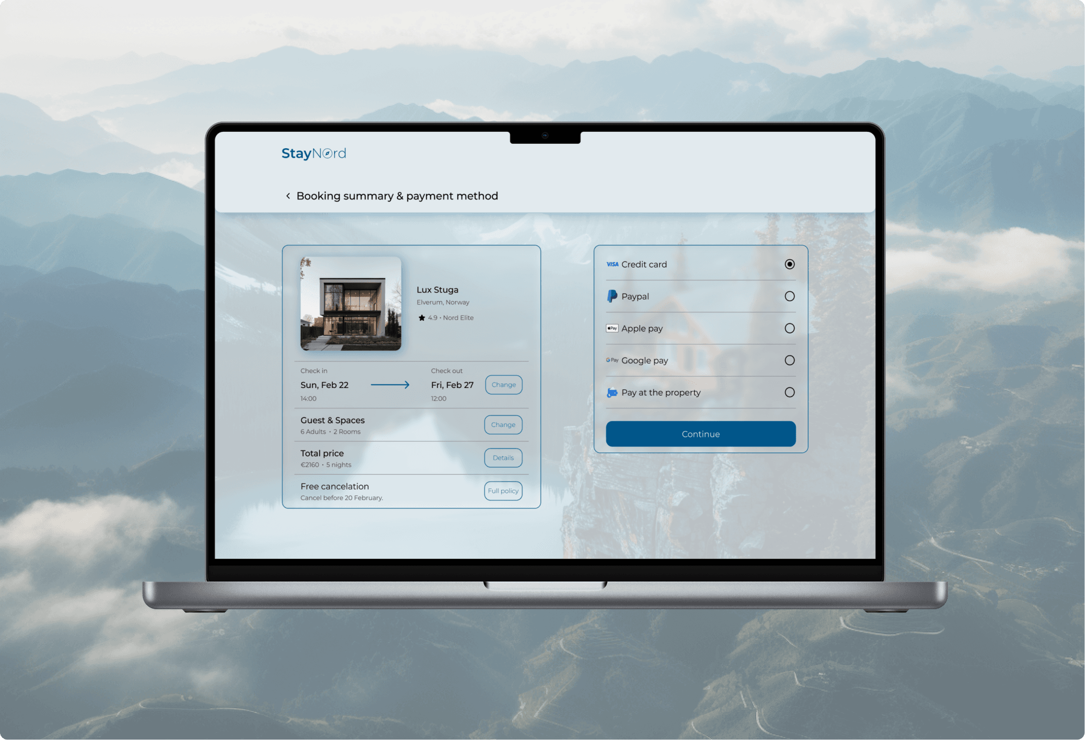
StayNord continues the search‑first principle into the reservation path: the interface keeps users focused from query to confirmation by minimizing visual noise and surfacing the impact of every choice through a persistent booking summary.


On desktop the same principles scale into a denser workspace: hero search with shortcuts, a sortable grid for fast comparison, and a persistent right‑hand booking summary that updates live as filters change.
Challenge :
Users were abandoning bookings late in the flow because pricing, cancellation terms and availability were revealed too late and required backtracking. The challenge was to design a reservation flow that removes uncertainty and keeps edits inline.
The solution introduces a stepper checkout with a persistent, editable booking summary, explicit price breakdown and clear microcopy so users can confirm with confidence before payment.


More Projects

UI / UX Design
StayNord Booking App
A personal UX/UI project designing a seamless and transparent booking experience for mountain retreats — from cozy cabins to luxury villas — inspired by Nordic simplicity.
Year :
2026
Industry :
Travel
Client :
Personal project
Project Duration :
4 weeks
Problem :
Travelers looking for mountain accommodation are often overwhelmed by cluttered interfaces, complicated filter systems and a lack of transparency during the booking process. Finding the right place — whether a luxury villa or a cozy camping spot — requires navigating through excessive information with no clear hierarchy, making it difficult to compare options and book with confidence.
Research :
Understanding Marko meant understanding a specific kind of frustration — the feeling of knowing exactly what you want but struggling to find it through layers of irrelevant information.
Through a detailed competitive analysis of Airbnb, Booking and Agoda, customer journey mapping and feature prioritisation, I identified the key moments where the booking experience breaks down and where StayNord could do better.
Design process :
Starting with user flows, I outlined the essential booking journeys to ensure clarity and efficiency from the very first interaction. Once the flow felt intuitive, I moved into low-fidelity wireframes, focusing on structure and layout before any visual decisions were made.
Building on that foundation, I developed a design system that defined core components — from rounded icons and button styles to variations of the search bar, which became a central element of StayNord's identity and user experience.
Solution :
StayNord addresses the core frustration of modern booking platforms — information overload. A Nordic-inspired glass interface strips away the unnecessary, bringing search and discovery to the forefront through an intuitive navigation and search bar that surfaces the right options instantly.
Filters are smart and minimal, showing only what matters. The checkout flow is structured in clear, logical steps — ensuring full transparency on pricing, amenities and availability without overwhelming the user at any point in the journey.
Booking experience :
StayNord continues the search‑first principle into the reservation path: the interface keeps users focused from query to confirmation by minimizing visual noise and surfacing the impact of every choice through a persistent booking summary.
On desktop the same principles scale into a denser workspace: hero search with shortcuts, a sortable grid for fast comparison, and a persistent right‑hand booking summary that updates live as filters change.
Challenge :
Users were abandoning bookings late in the flow because pricing, cancellation terms and availability were revealed too late and required backtracking. The challenge was to design a reservation flow that removes uncertainty and keeps edits inline.
The solution introduces a stepper checkout with a persistent, editable booking summary, explicit price breakdown and clear microcopy so users can confirm with confidence before payment.
More Projects
UI / UX Design
StayNord Booking App
A personal UX/UI project designing a seamless and transparent booking experience for mountain retreats — from cozy cabins to luxury villas — inspired by Nordic simplicity.
Year :
2026
Industry :
Travel
Client :
Personal project
Project Duration :
4 weeks
Problem :
Travelers looking for mountain accommodation are often overwhelmed by cluttered interfaces, complicated filter systems and a lack of transparency during the booking process. Finding the right place — whether a luxury villa or a cozy camping spot — requires navigating through excessive information with no clear hierarchy, making it difficult to compare options and book with confidence.
Research :
Understanding Marko meant understanding a specific kind of frustration — the feeling of knowing exactly what you want but struggling to find it through layers of irrelevant information.
Through a detailed competitive analysis of Airbnb, Booking and Agoda, customer journey mapping and feature prioritisation, I identified the key moments where the booking experience breaks down and where StayNord could do better.
Design process :
Starting with user flows, I outlined the essential booking journeys to ensure clarity and efficiency from the very first interaction. Once the flow felt intuitive, I moved into low-fidelity wireframes, focusing on structure and layout before any visual decisions were made.
Building on that foundation, I developed a design system that defined core components — from rounded icons and button styles to variations of the search bar, which became a central element of StayNord's identity and user experience.
Solution :
StayNord addresses the core frustration of modern booking platforms — information overload. A Nordic-inspired glass interface strips away the unnecessary, bringing search and discovery to the forefront through an intuitive navigation and search bar that surfaces the right options instantly.
Filters are smart and minimal, showing only what matters. The checkout flow is structured in clear, logical steps — ensuring full transparency on pricing, amenities and availability without overwhelming the user at any point in the journey.
Booking experience :
StayNord continues the search‑first principle into the reservation path: the interface keeps users focused from query to confirmation by minimizing visual noise and surfacing the impact of every choice through a persistent booking summary.
On desktop the same principles scale into a denser workspace: hero search with shortcuts, a sortable grid for fast comparison, and a persistent right‑hand booking summary that updates live as filters change.
Challenge :
Users were abandoning bookings late in the flow because pricing, cancellation terms and availability were revealed too late and required backtracking. The challenge was to design a reservation flow that removes uncertainty and keeps edits inline.
The solution introduces a stepper checkout with a persistent, editable booking summary, explicit price breakdown and clear microcopy so users can confirm with confidence before payment.