UI / UX Design
Kama Ceramic App
A personal UX/UI project exploring minimal, Japanese-inspired design for a handcrafted and unique products shopping experience — across mobile and desktop.
Year :
2025
Industry :
E-Commerce
Client :
Personal Project
Project Duration :
6 weeks

Problem :
Shoppers looking for unique, handcrafted products often find themselves navigating generic e-commerce platforms that fail to highlight the story behind the maker.
Search is broad, product presentation is inconsistent, and payment options lack transparency — making it difficult to build trust and make confident purchasing decisions.
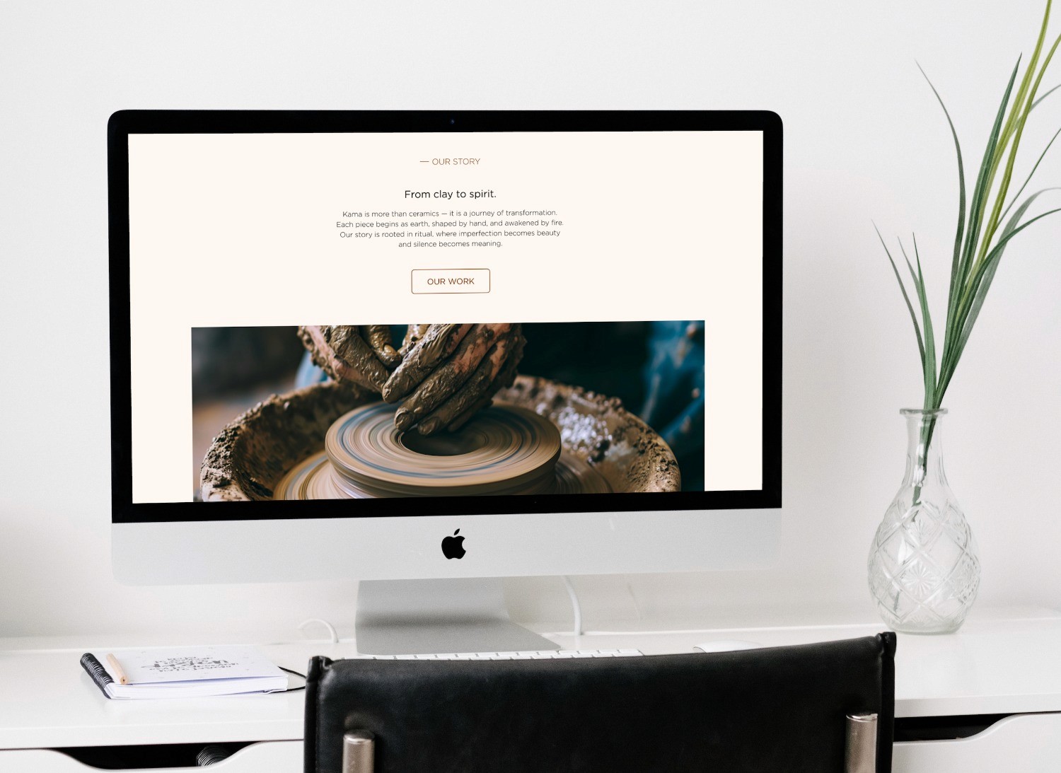
Kama was designed to solve exactly that — a minimal, intuitive experience where the product and the person behind it take center stage.


Research :
Before opening Figma, I invested time in understanding the user and the market. I created a user persona based on real behavioral patterns — a young, design-conscious shopper who values authenticity and the story behind the product.


The research revealed a clear gap in the market — users seeking handcrafted products want more than just a transaction. They want to connect with the maker, trust the platform and navigate with ease. These insights became the foundation for every design decision in Kama.
Through user interviews, surveys and competitive analysis, I built a clear picture of what was missing in the current landscape of handcrafted product shopping.

Design process :
Starting with user flows, I mapped out the key journeys before sketching low-fidelity wireframes focused on structure and layout. Once the flow and skeleton felt right, I built a design system — defining components, buttons, icons and styles — before moving into the final UI design guided by a minimal color palette and clean typography that reflect Kama's warm, intentional aesthetic.


Solution :
Kama was designed around three core principles — clarity, trust and personalization. A minimal interface puts the product and the maker's story front and center, while an intuitive search and filtering system helps users discover exactly what they're looking for.
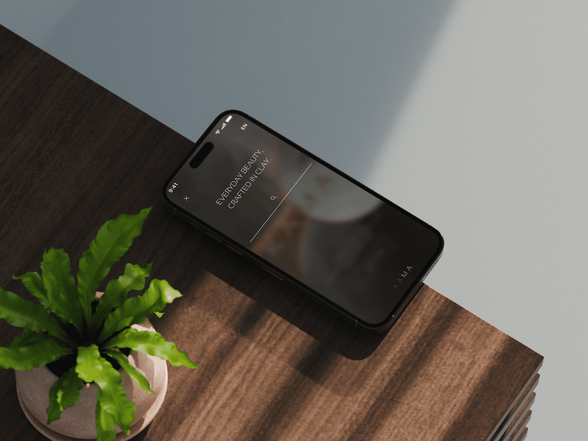
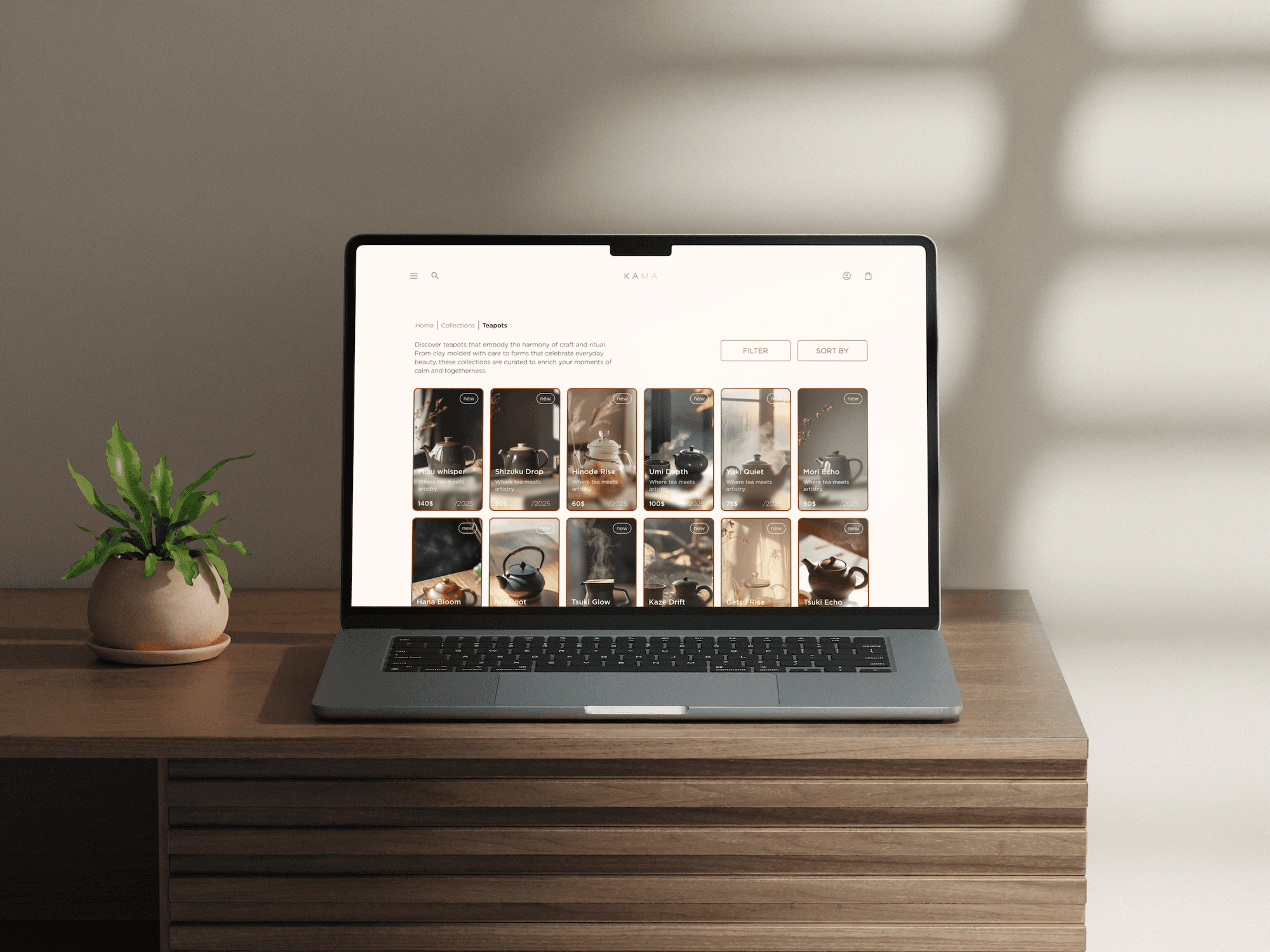
Clear product photography, transparent pricing and delivery information, and secure payment options ensure a confident and enjoyable shopping experience across both mobile and desktop.


Checkout experience :
For a handcrafted products platform, trust is everything. Research showed that users abandon purchases when payment options are limited, delivery costs are unclear or the checkout flow feels complicated.


Kama addresses this through multiple payment options, fully transparent pricing and delivery information presented upfront, and a clean step-by-step flow that guides the user from cart to confirmation without friction or second-guessing.
Challenges :
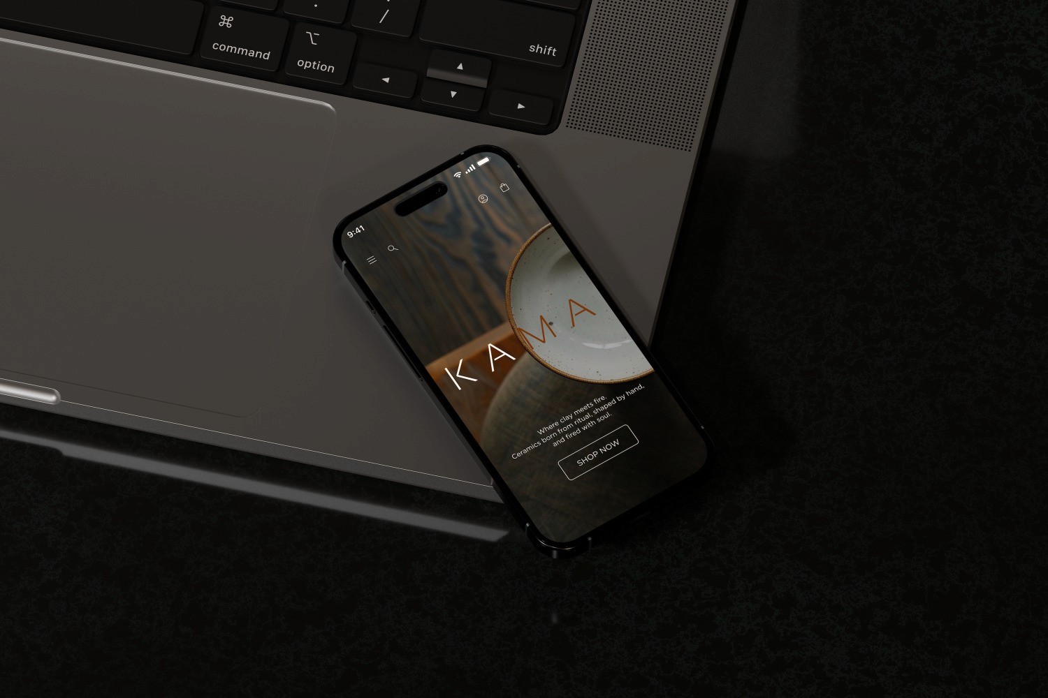
The biggest challenge was designing an interface that breathes — minimal enough to feel clean, yet rich enough to do justice to the products it showcases. Every layout decision became a balancing act between white space and visual warmth, between restraint and expression. This project taught me that minimalism isn't about removing elements — it's about giving the right ones room to shine


More Projects

UI / UX Design
Kama Ceramic App
A personal UX/UI project exploring minimal, Japanese-inspired design for a handcrafted and unique products shopping experience — across mobile and desktop.
Year :
2025
Industry :
E-Commerce
Client :
Personal Project
Project Duration :
6 weeks
Problem :
Shoppers looking for unique, handcrafted products often find themselves navigating generic e-commerce platforms that fail to highlight the story behind the maker.
Search is broad, product presentation is inconsistent, and payment options lack transparency — making it difficult to build trust and make confident purchasing decisions.
Kama was designed to solve exactly that — a minimal, intuitive experience where the product and the person behind it take center stage.
Research :
Before opening Figma, I invested time in understanding the user and the market. I created a user persona based on real behavioral patterns — a young, design-conscious shopper who values authenticity and the story behind the product.
The research revealed a clear gap in the market — users seeking handcrafted products want more than just a transaction. They want to connect with the maker, trust the platform and navigate with ease. These insights became the foundation for every design decision in Kama.
Through user interviews, surveys and competitive analysis, I built a clear picture of what was missing in the current landscape of handcrafted product shopping.
Design process :
Starting with user flows, I mapped out the key journeys before sketching low-fidelity wireframes focused on structure and layout. Once the flow and skeleton felt right, I built a design system — defining components, buttons, icons and styles — before moving into the final UI design guided by a minimal color palette and clean typography that reflect Kama's warm, intentional aesthetic.
Solution :
Kama was designed around three core principles — clarity, trust and personalization. A minimal interface puts the product and the maker's story front and center, while an intuitive search and filtering system helps users discover exactly what they're looking for.
Clear product photography, transparent pricing and delivery information, and secure payment options ensure a confident and enjoyable shopping experience across both mobile and desktop.
Checkout experience :
For a handcrafted products platform, trust is everything. Research showed that users abandon purchases when payment options are limited, delivery costs are unclear or the checkout flow feels complicated.
Kama addresses this through multiple payment options, fully transparent pricing and delivery information presented upfront, and a clean step-by-step flow that guides the user from cart to confirmation without friction or second-guessing.
Challenges :
The biggest challenge was designing an interface that breathes — minimal enough to feel clean, yet rich enough to do justice to the products it showcases. Every layout decision became a balancing act between white space and visual warmth, between restraint and expression. This project taught me that minimalism isn't about removing elements — it's about giving the right ones room to shine
More Projects
UI / UX Design
Kama Ceramic App
A personal UX/UI project exploring minimal, Japanese-inspired design for a handcrafted and unique products shopping experience — across mobile and desktop.
Year :
2025
Industry :
E-Commerce
Client :
Personal Project
Project Duration :
6 weeks
Problem :
Shoppers looking for unique, handcrafted products often find themselves navigating generic e-commerce platforms that fail to highlight the story behind the maker.
Search is broad, product presentation is inconsistent, and payment options lack transparency — making it difficult to build trust and make confident purchasing decisions.
Kama was designed to solve exactly that — a minimal, intuitive experience where the product and the person behind it take center stage.
Research :
Before opening Figma, I invested time in understanding the user and the market. I created a user persona based on real behavioral patterns — a young, design-conscious shopper who values authenticity and the story behind the product.
The research revealed a clear gap in the market — users seeking handcrafted products want more than just a transaction. They want to connect with the maker, trust the platform and navigate with ease. These insights became the foundation for every design decision in Kama.
Through user interviews, surveys and competitive analysis, I built a clear picture of what was missing in the current landscape of handcrafted product shopping.
Design process :
Starting with user flows, I mapped out the key journeys before sketching low-fidelity wireframes focused on structure and layout. Once the flow and skeleton felt right, I built a design system — defining components, buttons, icons and styles — before moving into the final UI design guided by a minimal color palette and clean typography that reflect Kama's warm, intentional aesthetic.
Solution :
Kama was designed around three core principles — clarity, trust and personalization. A minimal interface puts the product and the maker's story front and center, while an intuitive search and filtering system helps users discover exactly what they're looking for.
Clear product photography, transparent pricing and delivery information, and secure payment options ensure a confident and enjoyable shopping experience across both mobile and desktop.
Checkout experience :
For a handcrafted products platform, trust is everything. Research showed that users abandon purchases when payment options are limited, delivery costs are unclear or the checkout flow feels complicated.
Kama addresses this through multiple payment options, fully transparent pricing and delivery information presented upfront, and a clean step-by-step flow that guides the user from cart to confirmation without friction or second-guessing.
Challenges :
The biggest challenge was designing an interface that breathes — minimal enough to feel clean, yet rich enough to do justice to the products it showcases. Every layout decision became a balancing act between white space and visual warmth, between restraint and expression. This project taught me that minimalism isn't about removing elements — it's about giving the right ones room to shine